Bad UX – 5 web design trends that are bad for business
Trends in design are natural. Designers see things they like and collect it as inspiration. Eventually more designers begin to produce similar work and eventually you end up with a common way of doing things. A trend.
Trends aren't inherently bad, but following web trends without really understanding why you would use them, is. Many of the most popular web design trends are actively giving users a bad experience on many websites.
Here's five common web design trends that might be bad for business.
1. Hero Sliders
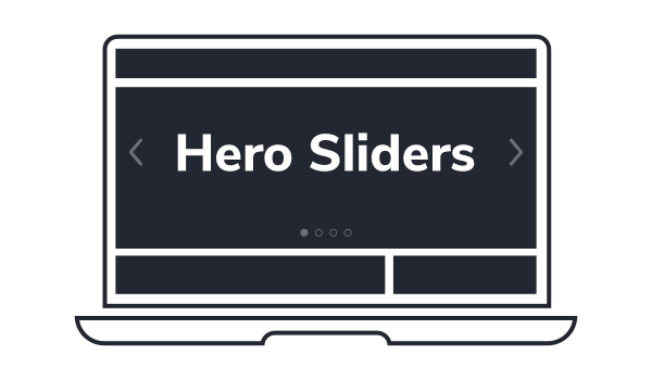
Hero sliders are typically a carousel or slideshow of content, placed prominently at the top of a website's homepage.
They are a common feature in many Wordpress themes, especially a fullscreen version that fills the entire broswer window. The intention is to allow the website owner to showcase features or products or special offers, with the expectation that the website user will browse through these slides.
Why hero sliders are bad UX
Despite their popularity, tests have shown that interaction with slides besides the first is significantly lower. The reason being, many people simply don't see any slides besides the first. In fact, it's not uncommon for someone to simply scroll past the slider completely, assuming the first slide is simply a static section of a website.
This is particularly true if the the navigation on the sliders is not prominent. Sometimes it's even hidden completely, unless you hover your cursor in a certain area.
That's not to say you shouldn't use carousels and sliders at all. They are a great way to include a lot of information in a small amount of space. But their visual design and how you signal to the user that there is additional content to be discovered is a very important factor in how effective they are.
2. 'Hamburger' Menus
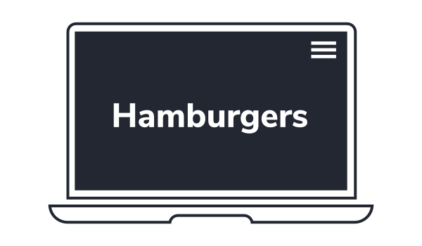
The so-called 'hamburger' menu, named for it's three-line construction that abstractly represents a patty between a bun, is something of a controversial topic. They're nothing new, in fact they've been around since 1981, but they've became popular in the last decade with the rise of responsive and mobile-friendly design.
Their purpose is to give designers more screenspace to work with by hiding the navigation in favour of (what the designer feels) is more important content.
Most commonly found on mobile versions of websites or apps where screenspace is at a premium, they have started to become more prevalent on desktop versions of websites, and this is a bad trend to follow.
Why hamburger menus are bad UX
Much like hero sliders, they hide important content (site navigation) away from the user. They are becoming more recognisable as a design pattern over time, and you can argue that there is a time and a place for them.
If you're reading this on a mobile or tablet, chances are you've noticed I actually use a hamburger on my own site, but I accompany the icon itself with descriptive text for context. It's important to label functionality as much as you can to prevent confusion.

However, I would never recommend a hamburger in place of a typical navigation menu on a desktop site. Never. It's bad UX through and through.
There are techniques you can use to make the menu more 'discoverable', but the fact remains that the hamburger menu is a barrier to finding content, and I'm sure you want your customers to find your content?
Spotify tested the hamburger menu in their iOS app against a tab menu at the bottom of the app and discovered that user engagement with the tab bar was 30% higher than with the hamburger alone.
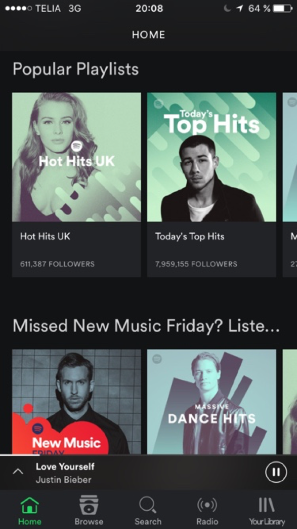
They also found that more new users interacted with the tab menu during their first use of the app, as opposed to the hamburger.
3. Mystery Meat Navigation
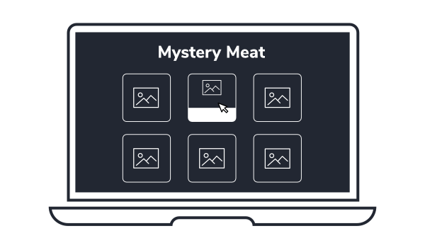
Mystery Meat refers to meat that is not specified. Is it beef? Pork? Chicken? The only way to know for sure is to taste it and see.
Mystery Meat Navigation (MMN) is a term for navigation that is unclear. The only way to know where a link takes you is to click it and see. This is common on apps that use subjective icons for navigation without contextual labels or anchor text, but can also be found on websites.
Portfolio sites often feature mystery meat, commonly a grid of images that likely link through to individual case-studies, that require a user to hover their cursor over them for extra context about the work.

Why mystery meat is bad UX
Noticed the trend in this article yet? The design trends dicussed in this article all hide important information or functionality away for the sake of a minimalist design. In the case of mystery meat, it can even require functionality that is not supported across all devices.
Requiring a user to hover their cursor for example, will not work with touchscreens. It breaks functionality and consistency across the site.
This is why the mobile-first design philosophy is popular. If it works on mobile, it works on desktop. If something is not needed on mobile, then is it even needed on desktop?
4. Fullscreen page sections
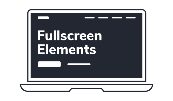
Full screen sections on websites are increasingly popular thanks to another trend of many sites now working like apps (thank you Javascript developers).
This is a trend that's perhaps most common with design agencies. And if design agencies are doing it, you can bet others will soon follow suit.
Why fullscreen page sections are bad UX
Unlike the previous trends, full-screen sections don't really hide content away, at least not in the same way. But they can reduce discoverability of other content through something called the illusion of completeness.
If there's no indication of additional content to follow, it's not uncommon for people to assume that they are viewing the entirety of the page's content, possibly causing confusion and page bounce.
You can't just assume that everybody will scroll. Many designers will use some kind of animated icon or arrow to indicate to the user that they should scroll. But this is a remedy to a problem the designer themself has created.
5. Animating too many elements
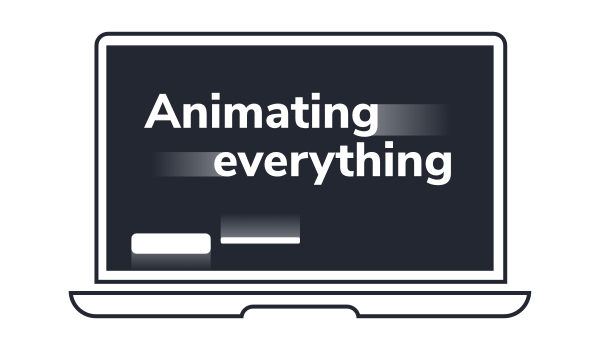
Confession: I like to animate elements but I do try to be conservative.
Animating content on a page is a great way to draw attention to it, and it can be used to give websites a nice 'modern' feel.
Our eyes are naturally drawn to movement, so if you want people to notice something, make it move. Just don't overdo it.
Why animating elements is bad UX
Not only can too many elements moving at once be overwhelming, it can also slow down the user as they're having to wait for everything to finish moving before they can digest it. It's visual fluff for the sake of it.
The worst use of this is perhaps animating in text elements when a user scrolls or loads a page. Again, used sparingly can be very effective, but when you over use it, you degrade it's purpose.
It can also increase the load times of pages (bad for SEO) with the extra Javscript, mark-up and CSS files that need to be loaded in order for it to work.
It's not a huge overhead, but can soon add up. especially if you're not optimising your pages correctly.
Should you follow web design trends?
Personally, I try not to follow web design trends, especially since my aim it is to meet the needs of the end-user. Websites built on trends may look flashy and professional to the untrained eye, but they often provide no real value to the user experience and as we've discovered in this article, may actually be making it worse.
Web design trends are also the bread and butter of many pre-built Wordpress themes, which attempt to cram in as many modern trends and gimmicks as possible in order to get more installations.
Trends are bad because they often focus purely on the aesthetic element. It's entirely possible that a trend evolved from a particular source, for which that design pattern or approach did make sense to implement. But taking a trend and blindly using it for your own design is very bad practice, and could be a sign of a lazy or inexperienced web designer.